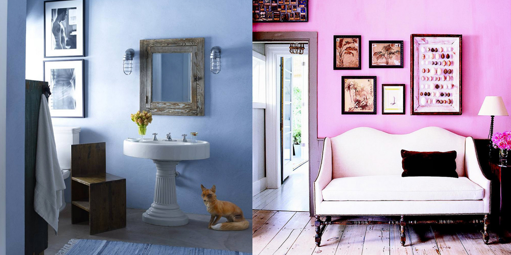
IF YOU AREN’T ON BOARD WITH THE COLORS OF THE YEAR YET… IT’S TIME
We were a little apprehensive too, but these pretty pastel hues actually work great in the home space.
http://www.elledecor.com/design-decorate/color/a8197/decorate-with-2016-colors-of-the-year/
To be honest, we were on the fence about Pantone’s colors of 2016 at first — we even offered up our own alternate color of the year.
But now that we’ve had a month to really mull it over, we have to admit, we’ve had a slight change of heart. We no longer look at Rose Quartz and Serenity and immediately think of baby showers. Instead, we think of beautifully decorated homes.
Pixersize, a wall mural company, agrees and have created a handy cheat sheet on how to integrate the soft shades into your home, using both hues or just one.
In particular, they pointed out that both shades work well in living rooms, bathrooms and bedrooms — though Serenity may be your best bedroom bet, considering blue is known to be a soothing color.
Both hues are also well suited for several design styles, including Scandinavian, minimal, shabby chic, and traditional French.
But what surprised us most was how well the colors play off other statement hues. Rose Quartz, for example, pairs perfectly with Opal Blue, Opal Gray, Orchid Haze, and Lilac Gray.
On the other hand, Serenity is an ideal match for Grapeade, Buttercup, Snorkel Blue, and Cocoon. And both colors of the year are well suited to be used with Peach Echo.
Take a look at the infographic below for even more ideas on decorating with the year’s hottest hues.

Curiosity of Elle Decor
http://www.elledecor.com/design-decorate/color/a8197/decorate-with-2016-colors-of-the-year/

